Components
A comprehensive guide to all custom components available in the MDX documentation.
Blockquote
Example of a blockquote:
This is a blockquote with the blue info icon. It's useful for highlighting important information or quotes.
Accordion
Here's an interactive accordion:
Here's how to create the accordion above:
<Accordion type="single" collapsible>
  <AccordionItem value="item-1">
    <AccordionTrigger>Is this an accordion?</AccordionTrigger>
    <AccordionContent>
      Yes! This is a fully functional accordion component that you can use in
      your documentation.
    </AccordionContent>
  </AccordionItem>
  <AccordionItem value="item-2">
    <AccordionTrigger>How do I use it?</AccordionTrigger>
    <AccordionContent>
      Just copy the code below and customize the content to your needs.
    </AccordionContent>
  </AccordionItem>
</Accordion>
Tabs
Here's an example of tabs in action:
Here's the code to create these tabs:
<Tabs defaultValue="preview">
  <TabsList>
    <TabsTrigger value="preview">Preview</TabsTrigger>
    <TabsTrigger value="code">Code</TabsTrigger>
  </TabsList>
  <TabsContent value="preview">
    This is the preview content that appears in the first tab.
  </TabsContent>
  <TabsContent value="code">
    This is where you might put code examples or documentation.
  </TabsContent>
</Tabs>
File Explorer
Here's a file system explorer:
Create this file explorer with:
<Files defaultValue="src/components">
  <Folder name="src">
    <Folder name="components">
      <File name="button.tsx" />
      <File name="card.tsx" />
    </Folder>
    <Folder name="pages">
      <File name="index.tsx" />
      <File name="about.tsx" />
    </Folder>
    <File name="app.tsx" />
  </Folder>
</Files>
Card Components
Here's a card component example:
This is the main content area of the card. You can put any content here.
Footer content goes here
Create cards using this code:
<Card>
  <CardHeader>
    <CardTitle>Beautiful Cards</CardTitle>
    <CardDescription>Create structured content with cards</CardDescription>
  </CardHeader>
  <CardContent>
    This is the main content area of the card. You can put any content here.
  </CardContent>
  <CardFooter>
    <p>Footer content goes here</p>
  </CardFooter>
</Card>
Alert Components
Here's an alert example:
This is how an alert looks. Use it to show important messages to your users.
Destructive variant:
This is how an alert looks. Use it to show important messages to your users.
Create alerts with:
<Alert>
  <AlertTitle>Heads up!</AlertTitle>
  <AlertDescription>
    This is how an alert looks. Use it to show important messages to your users.
  </AlertDescription>
</Alert>
Callout Components
Here's a callout example:
Pro tip
Callouts are perfect for highlighting important information, tips, or warnings in your documentation.
Warning
This is a warning callout. Use it to alert users about potential issues or things to watch out for.
Error
This is a danger callout. Use it to highlight critical errors or important warnings that require immediate attention.
Note
This is an info callout. Use it to provide additional context or helpful information to your users.
Create callouts using:
<Callout>
  <CalloutTitle>Pro tip</CalloutTitle>
  <CalloutDescription>
    Callouts are perfect for highlighting important information, tips, or
    warnings in your documentation.
  </CalloutDescription>
</Callout>
Steps Component
Here's how to create step-by-step guides:
Clone the repository
git clone https://github.com/rudrodip/mdx4.git my-docs
cd my-docs
Install dependencies
bun installStart the development server
bun run devCreate steps using:
<Steps>
  <Step>First, plan your documentation structure</Step>
  <Step>Then, write your content using these components</Step>
  <Step>Finally, preview and publish your documentation</Step>
</Steps>
Code Components
Here's a code block with syntax highlighting:
interface User {
  id: string;
  name: string;
  email: string;
}

const getUser = (id: string): User => {
  // Implementation here
};
Wrap code blocks with additional styling:
// Perlin noise implementation in TypeScript

class PerlinNoise {
private permutation: number[] = [];
private p: number[] = [];

constructor() {
this.permutation = Array.from({ length: 256 }, () => Math.floor(Math.random() \* 256));
this.p = [...this.permutation, ...this.permutation];
}

private fade(t: number): number {
return t _ t _ t _ (t _ (t \* 6 - 15) + 10);
}

private lerp(t: number, a: number, b: number): number {
return a + t \* (b - a);
}

private grad(hash: number, x: number, y: number, z: number): number {
const h = hash & 15;
const u = h < 8 ? x : y;
const v = h < 4 ? y : h === 12 || h === 14 ? x : z;
return ((h & 1) === 0 ? u : -u) + ((h & 2) === 0 ? v : -v);
}

public noise(x: number, y: number, z: number): number {
const X = Math.floor(x) & 255;
const Y = Math.floor(y) & 255;
const Z = Math.floor(z) & 255;

    x -= Math.floor(x);
    y -= Math.floor(y);
    z -= Math.floor(z);

    const u = this.fade(x);
    const v = this.fade(y);
    const w = this.fade(z);

    const A = this.p[X] + Y;
    const AA = this.p[A] + Z;
    const AB = this.p[A + 1] + Z;
    const B = this.p[X + 1] + Y;
    const BA = this.p[B] + Z;
    const BB = this.p[B + 1] + Z;

    return this.lerp(w, this.lerp(v, this.lerp(u, this.grad(this.p[AA], x, y, z), this.grad(this.p[BA], x - 1, y, z)),
      this.lerp(u, this.grad(this.p[AB], x, y - 1, z), this.grad(this.p[BB], x - 1, y - 1, z))),
      this.lerp(v, this.lerp(u, this.grad(this.p[AA + 1], x, y, z - 1), this.grad(this.p[BA + 1], x - 1, y, z - 1)),
      this.lerp(u, this.grad(this.p[AB + 1], x, y - 1, z - 1), this.grad(this.p[BB + 1], x - 1, y - 1, z - 1))));

}
}

// Example usage
const perlin = new PerlinNoise();
console.log(perlin.noise(1.1, 2.2, 3.3));
Example usage of Wrapped Code Block:
<CodeBlockWrapper>
  your code here
</CodeBlockWrapper>
Utility Components
Here's a linked card example:
Getting Started →
Learn how to get started with our documentation components.
Create linked cards using:
<LinkedCard href="/docs/getting-started">
  <h3>Getting Started →</h3>
  <p>Learn how to get started with our documentation components.</p>
</LinkedCard>
Zoomable Images
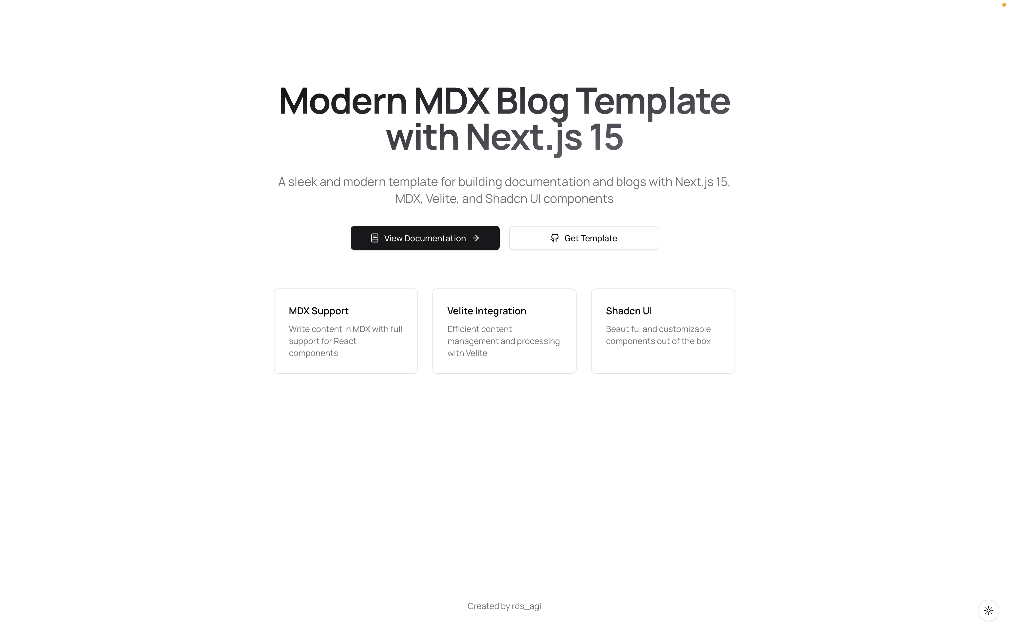
The ZoomableMedia component allows images to be clicked and zoomed in for better viewing:

Create zoomable images using:
<ZoomableMedia src="/og.png" alt="Example image" width={1200} height={630} />